
Outdoor
Nation
While at James Ross Advertising, I worked on the evolution of Outdoor Nation, a growing family of outdoor and lifestyle apparel brands. The project was about bringing more structure to a portfolio that was expanding quickly, while still giving each label—GILLZ, Reel Life, FinTech, and Mad Pelican—room to feel like itself. I helped shape the brand architecture, identity systems, guidelines, and digital experiences that made the portfolio easier to understand, easier to shop, and easier to grow.

Outdoor Nation
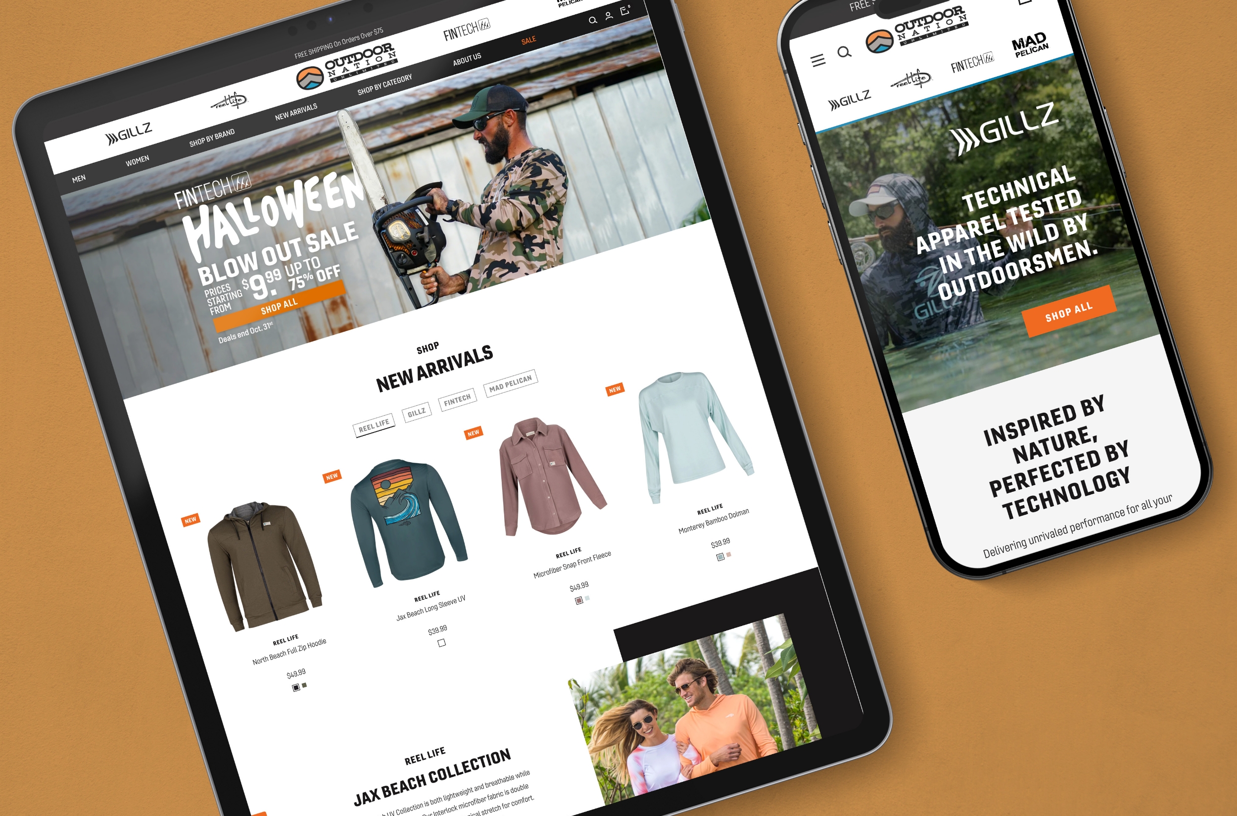
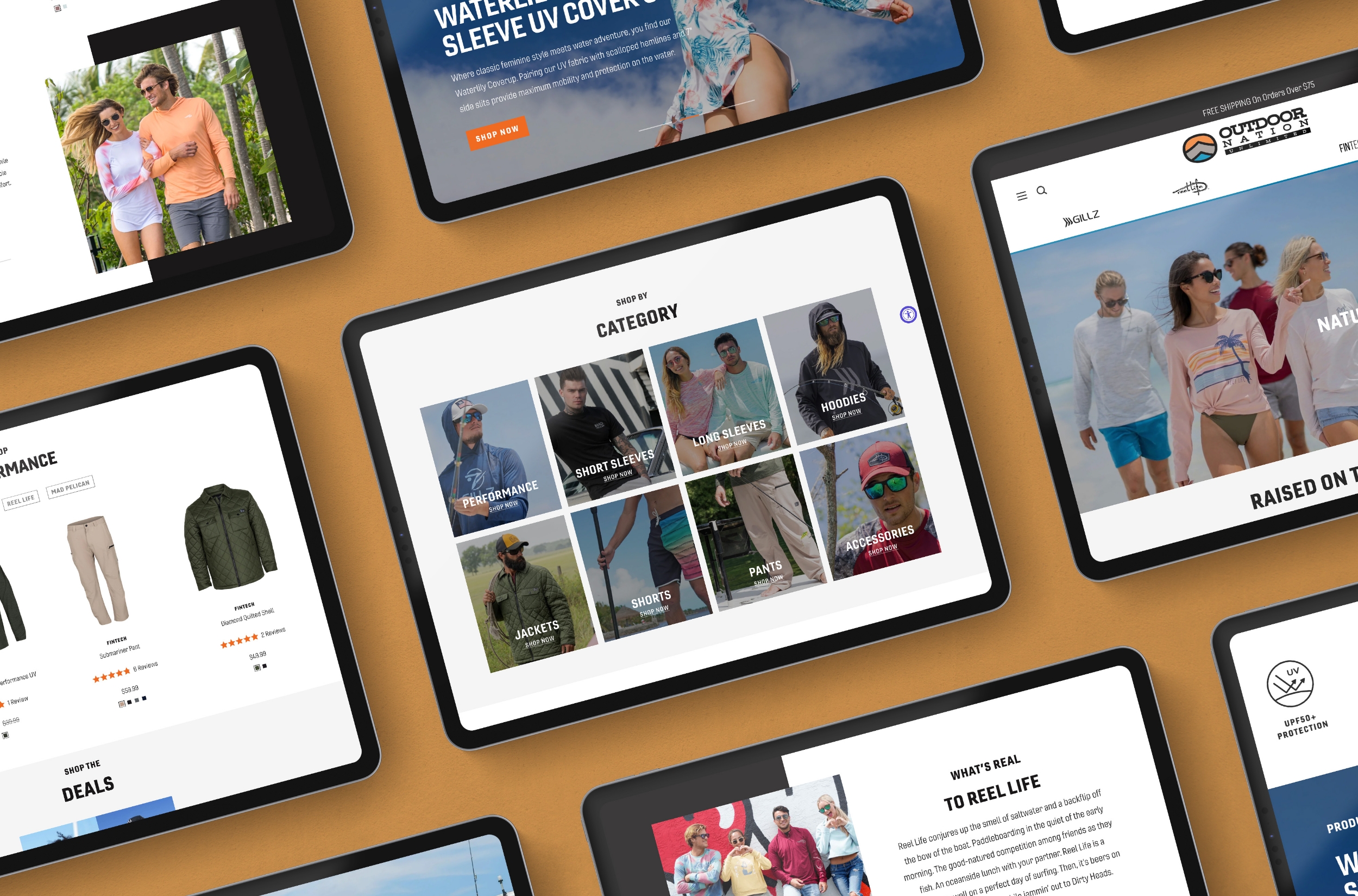
Outdoor Nation needed a digital experience that could hold several brands under one roof without making them feel the same. I helped shape a multi-brand e-commerce platform that gave GILLZ, Reel Life, FinTech, and Mad Pelican a shared structure while allowing each one to keep its own voice, look, and audience.
Brand and Digital Experience
Gillz
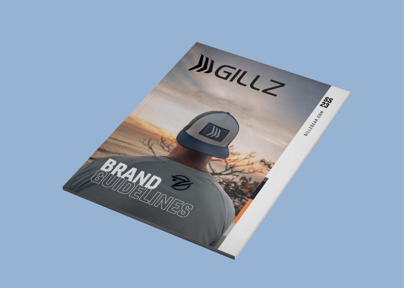
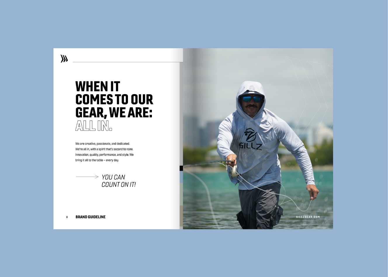
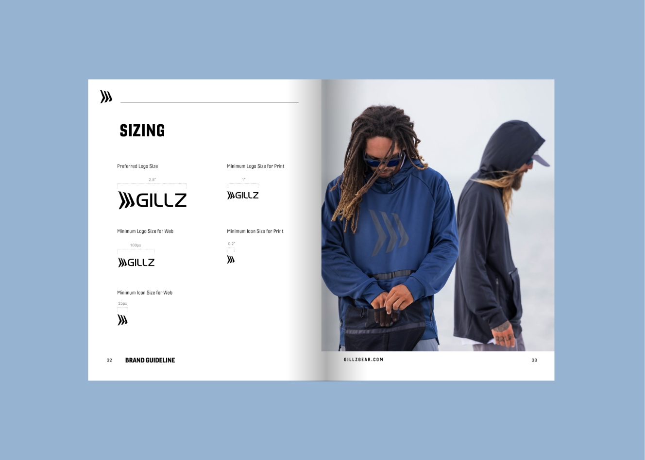
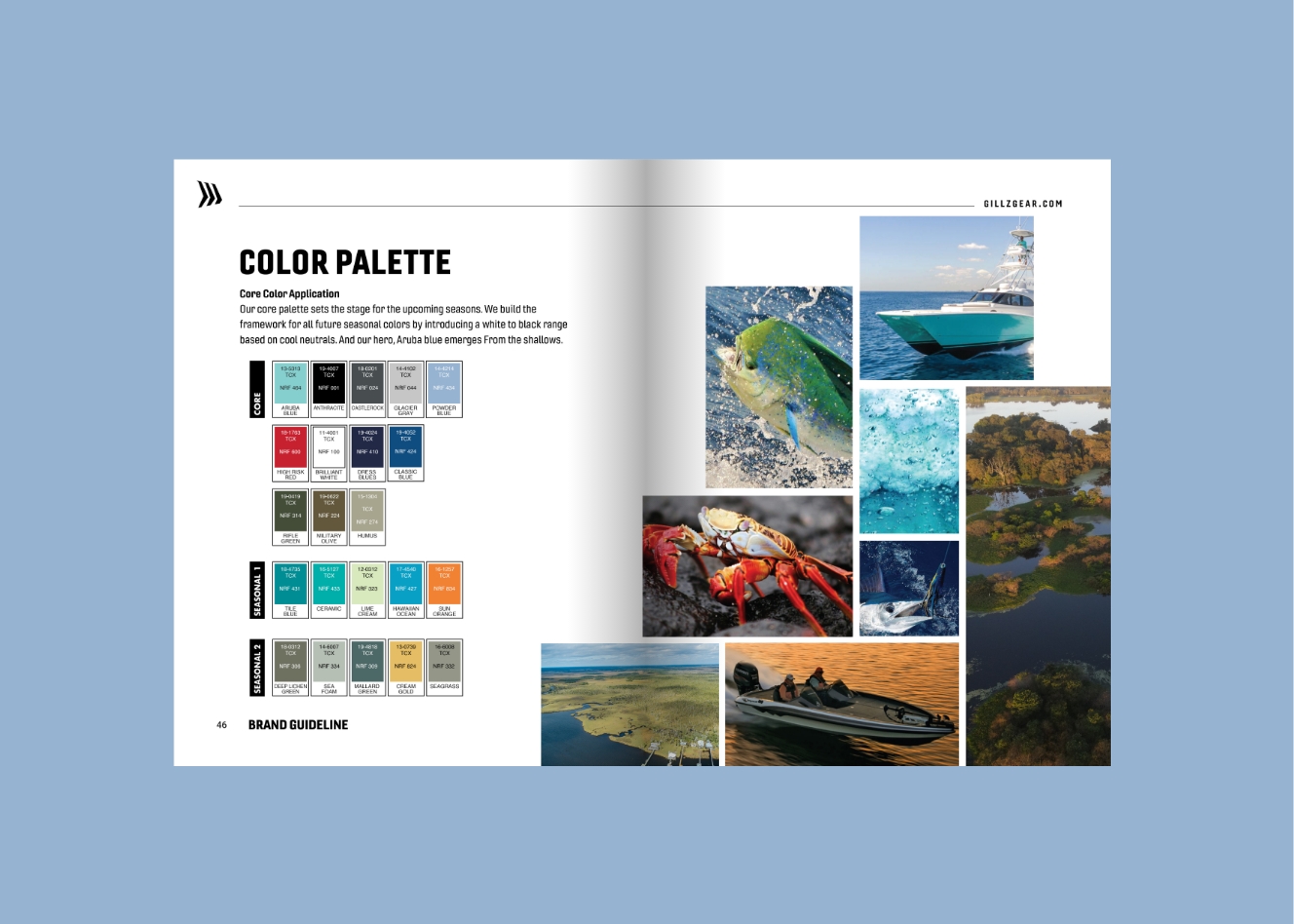
GILLZ needed a system that could support a performance-driven fishing apparel brand across retail, e-commerce, and seasonal marketing. I developed brand guidelines that clarified the personality, typography, color palette, photography direction, iconography, and usage standards—creating a stronger foundation for a brand built around function, confidence, and life on the water.
Explore full content here →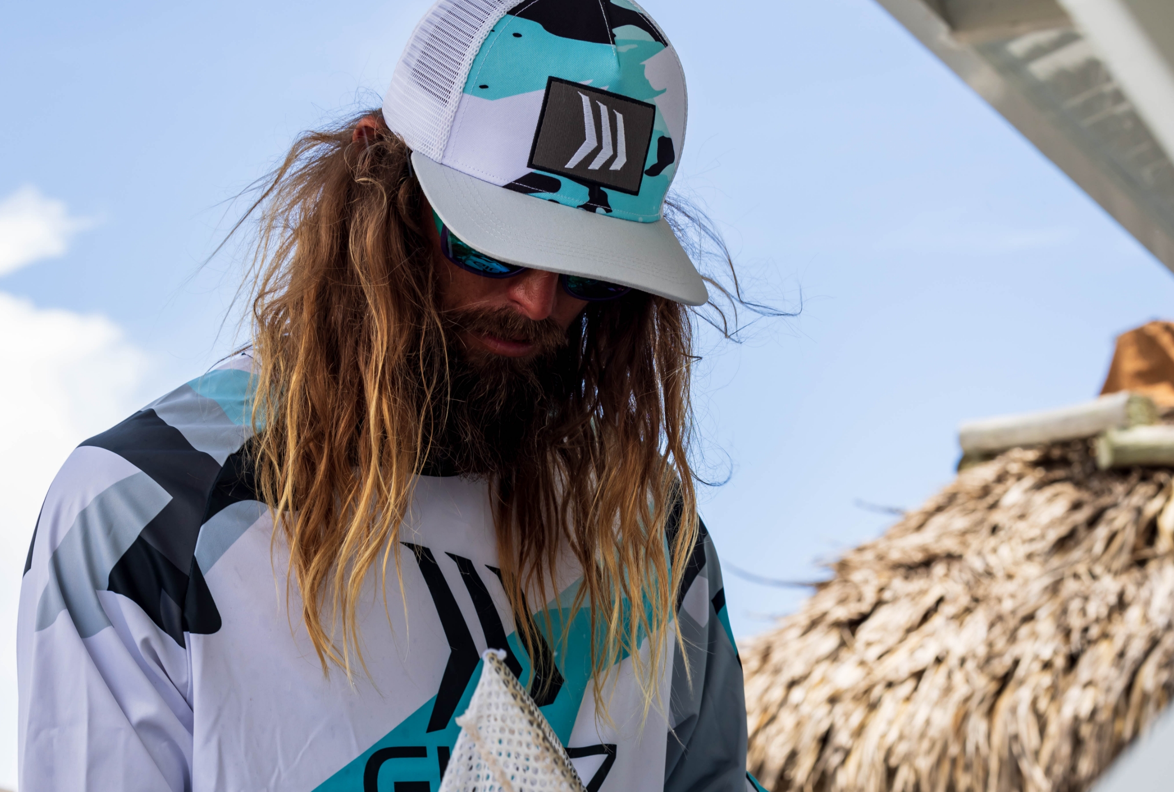


“The challenge was not to make every brand look the same. It was to create enough structure so each one could grow with confidence while still keeping its own personality.”— Delfos Almagro
Reel Life
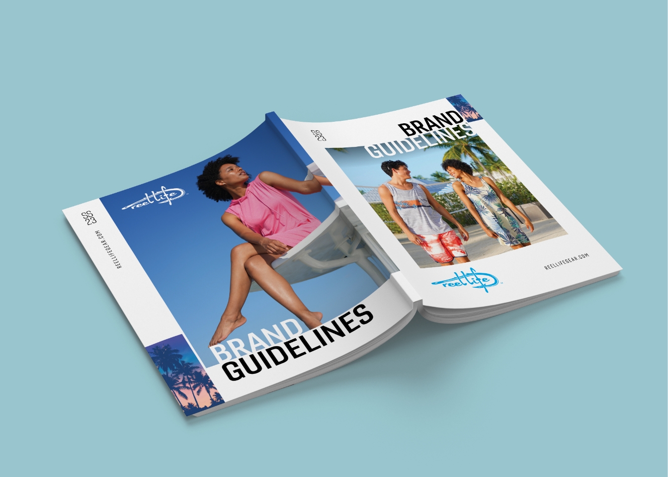
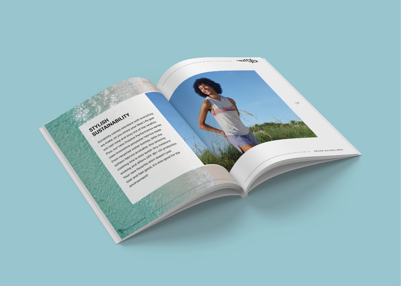
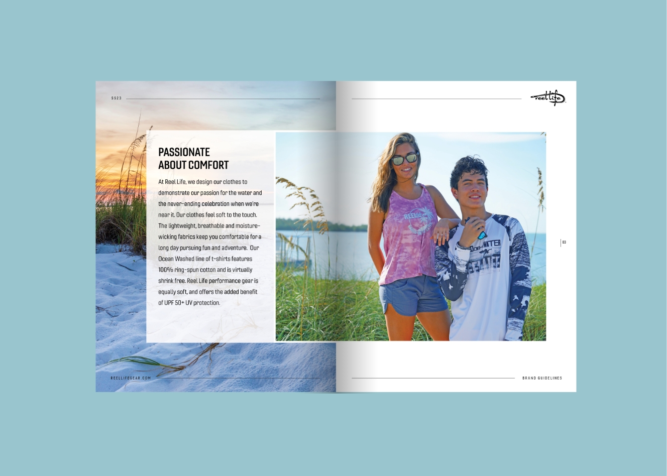
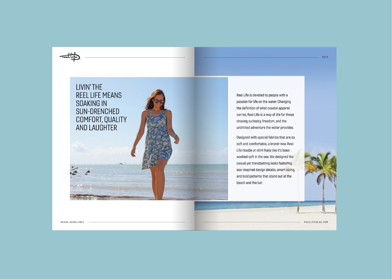
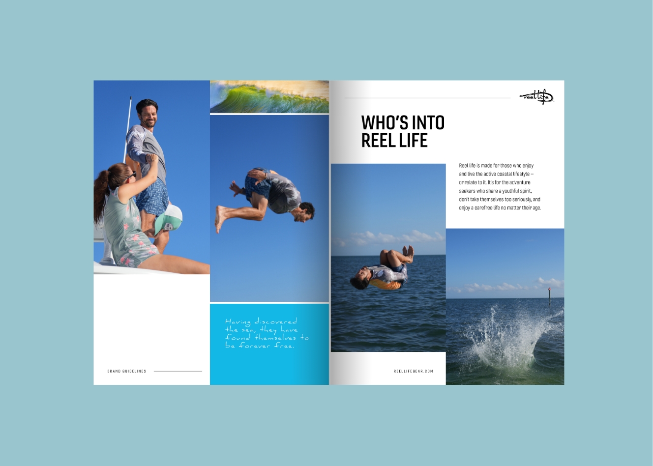
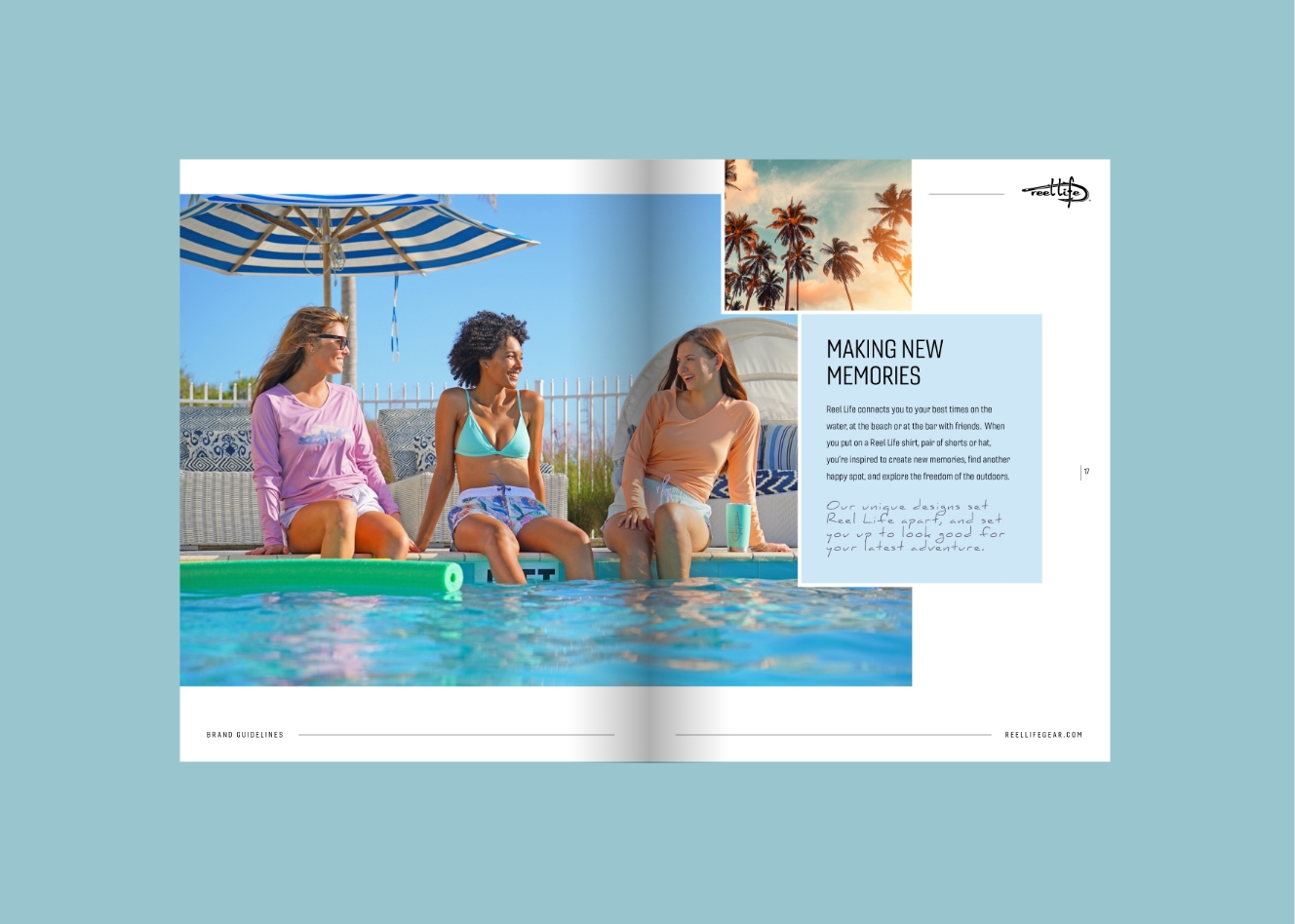
Reel Life had a more relaxed, coastal point of view, so the guidelines needed to feel effortless rather than overbuilt. I developed a visual and storytelling system rooted in sun, water, and everyday outdoor living—defining voice, photography, color, typography, and layout principles for retail, e-commerce, and seasonal campaigns.
Explore full content here →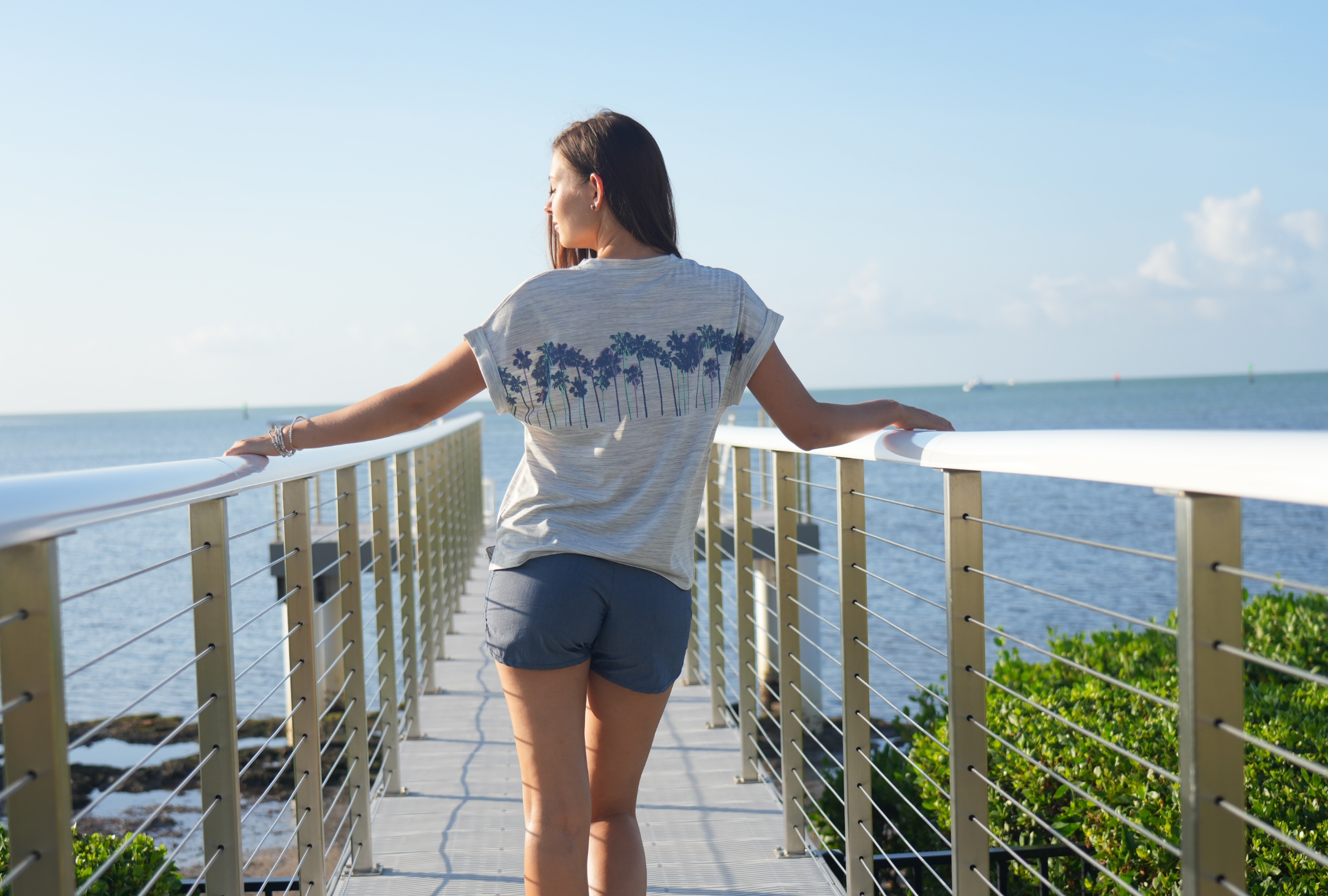
FinTech
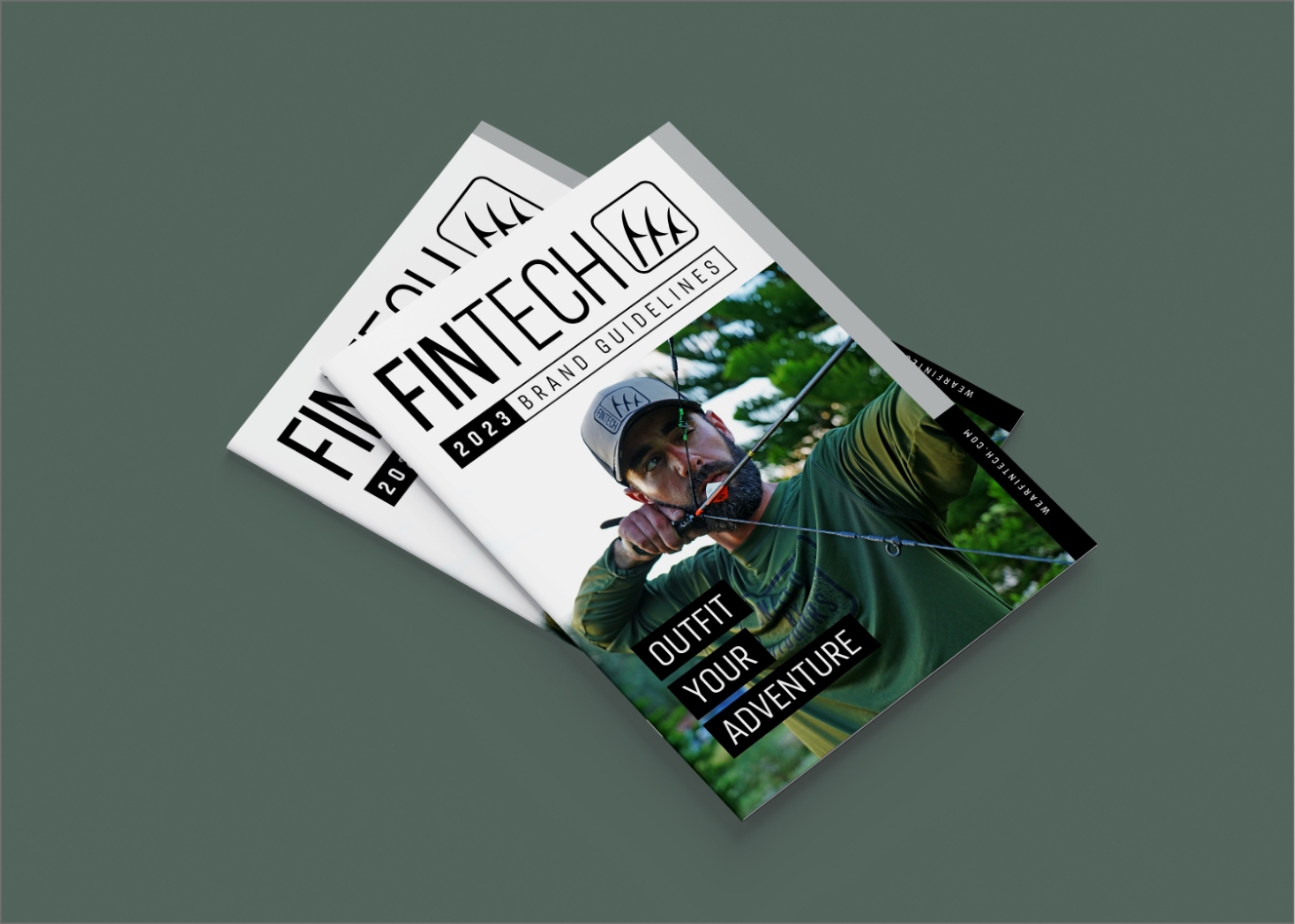
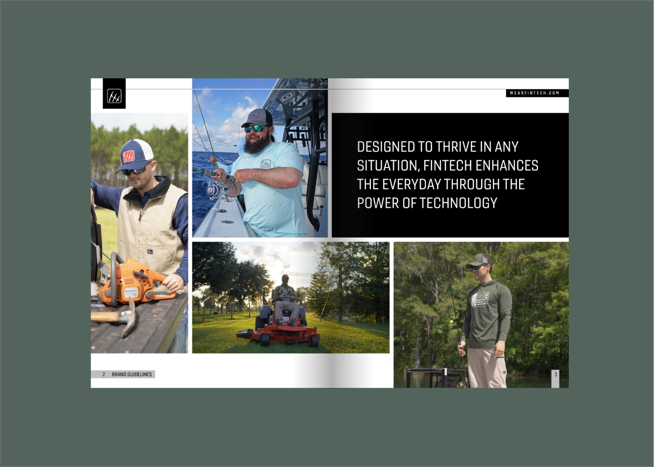
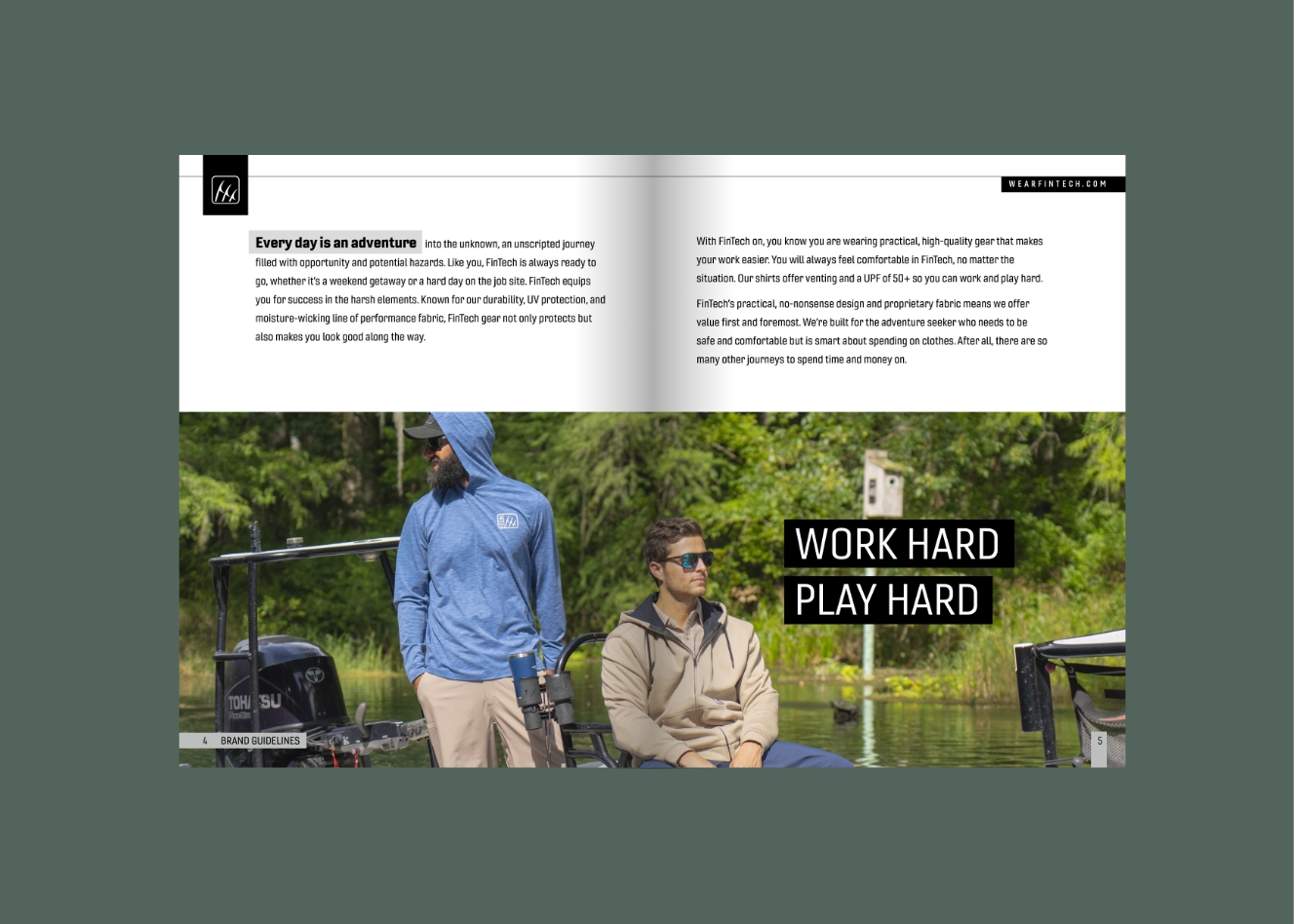
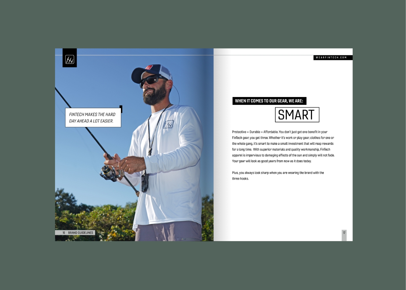
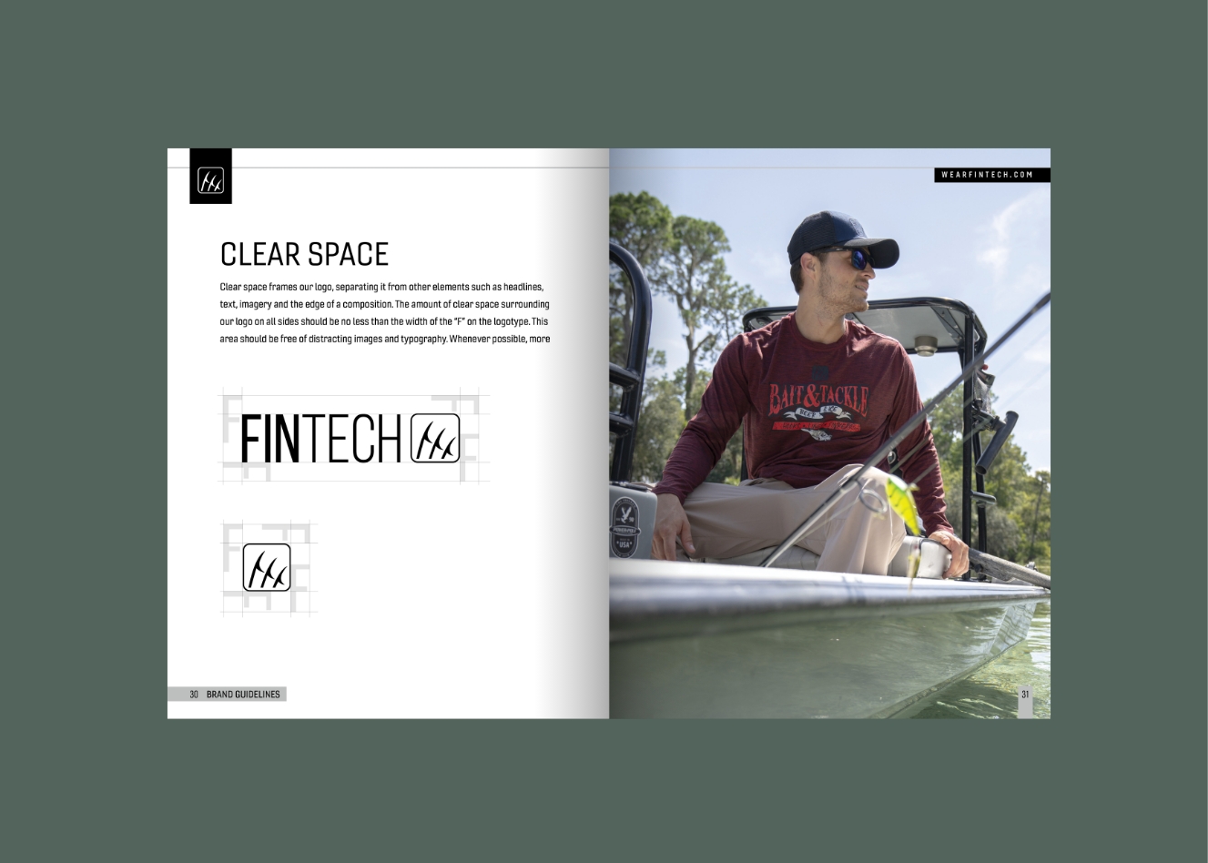
FinTech needed to feel tougher, more technical, and more utility-driven. I developed guidelines that defined the logo system, typography, color strategy, messaging tone, and usage standards, giving the brand a clear foundation built around durability, protection, and function-first design.
Explore full content here →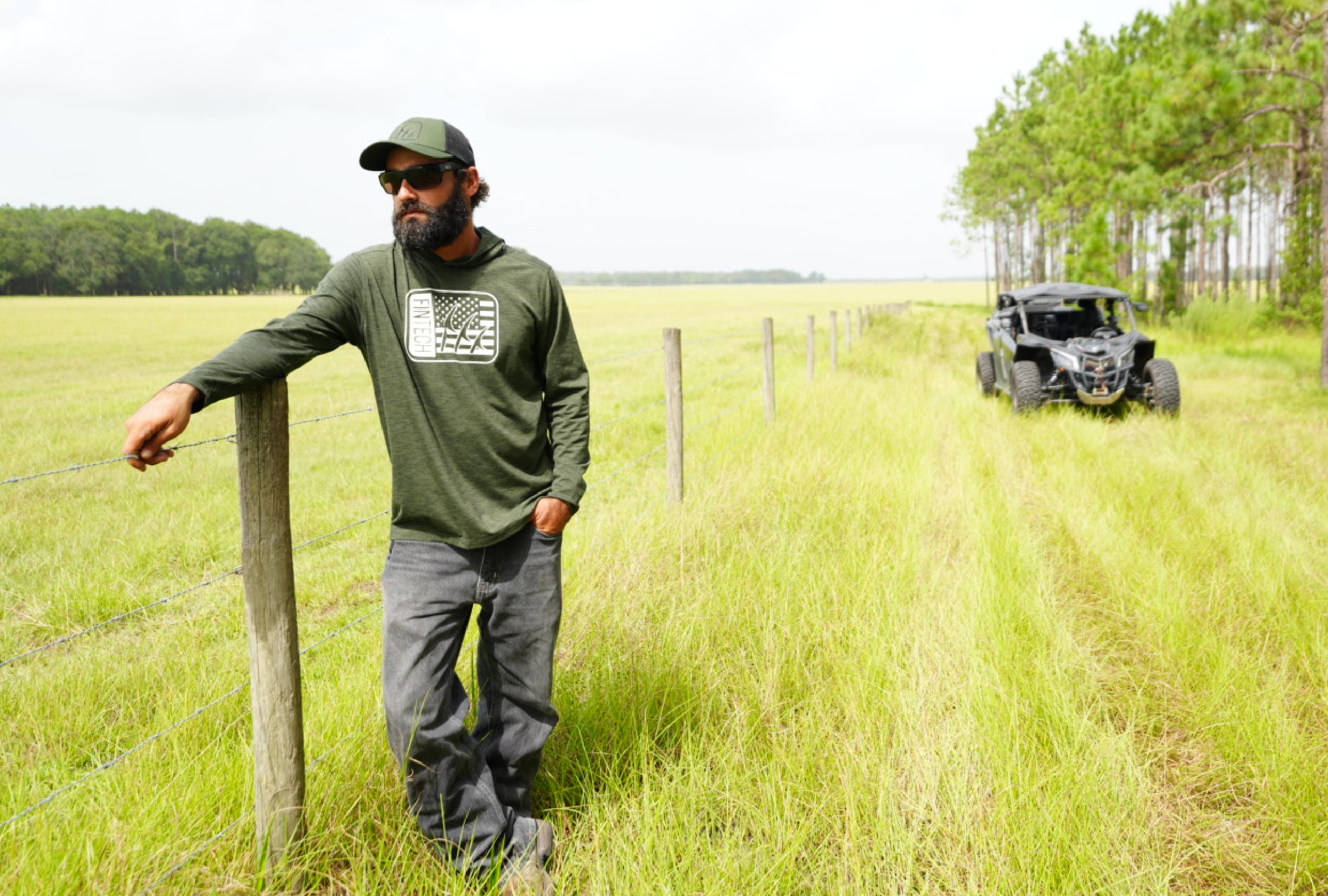

San Francisco City Lights
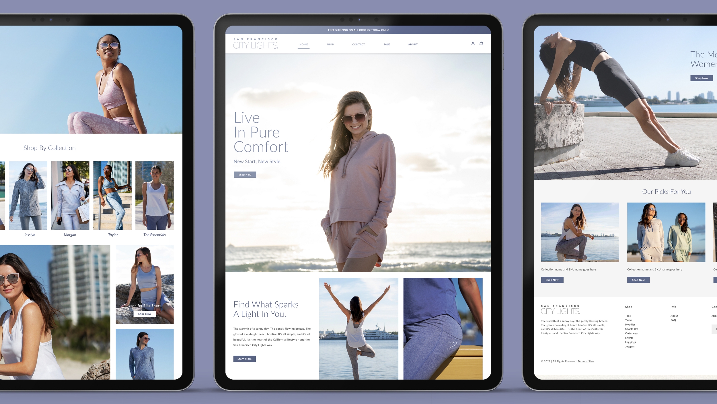
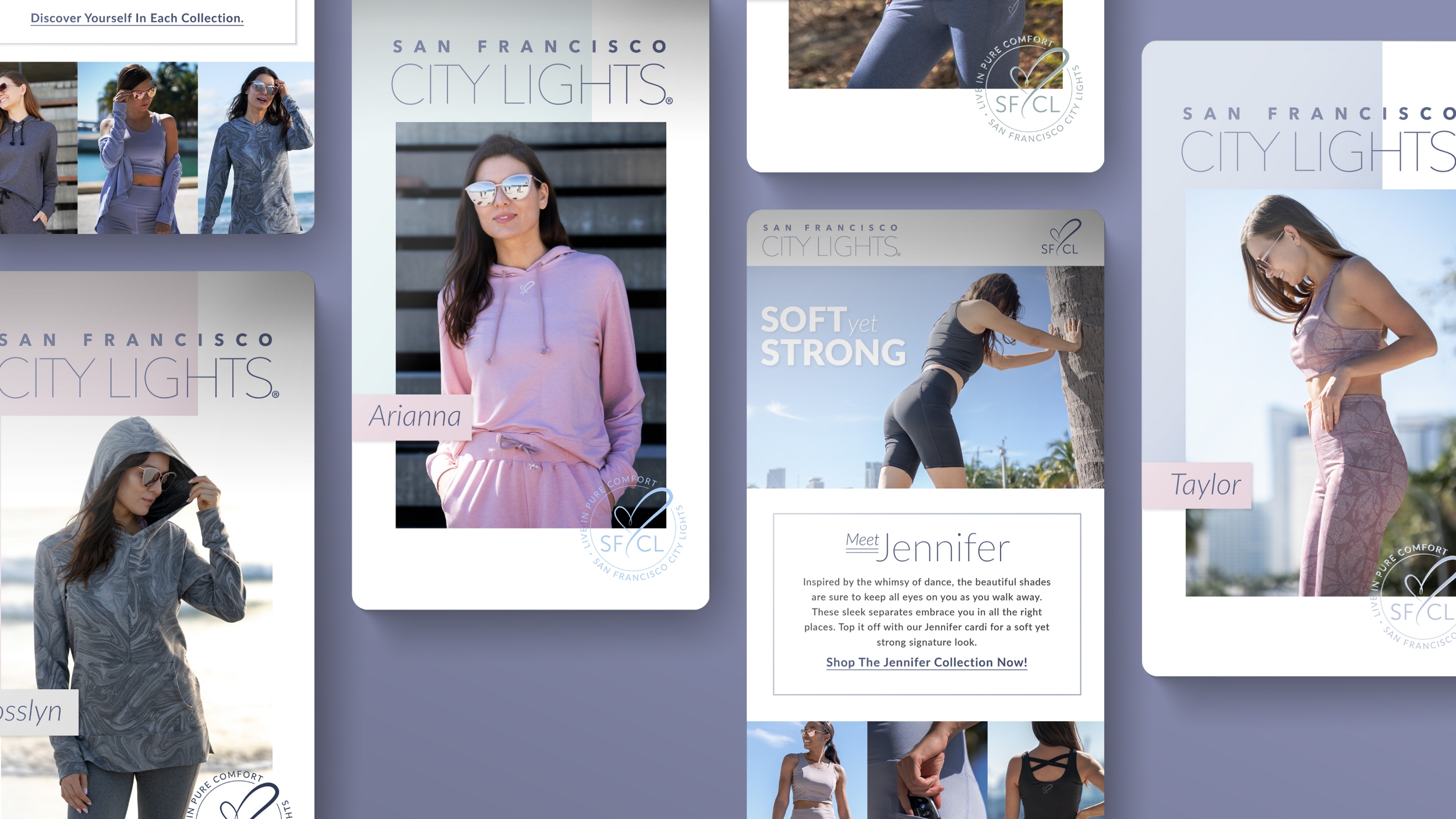
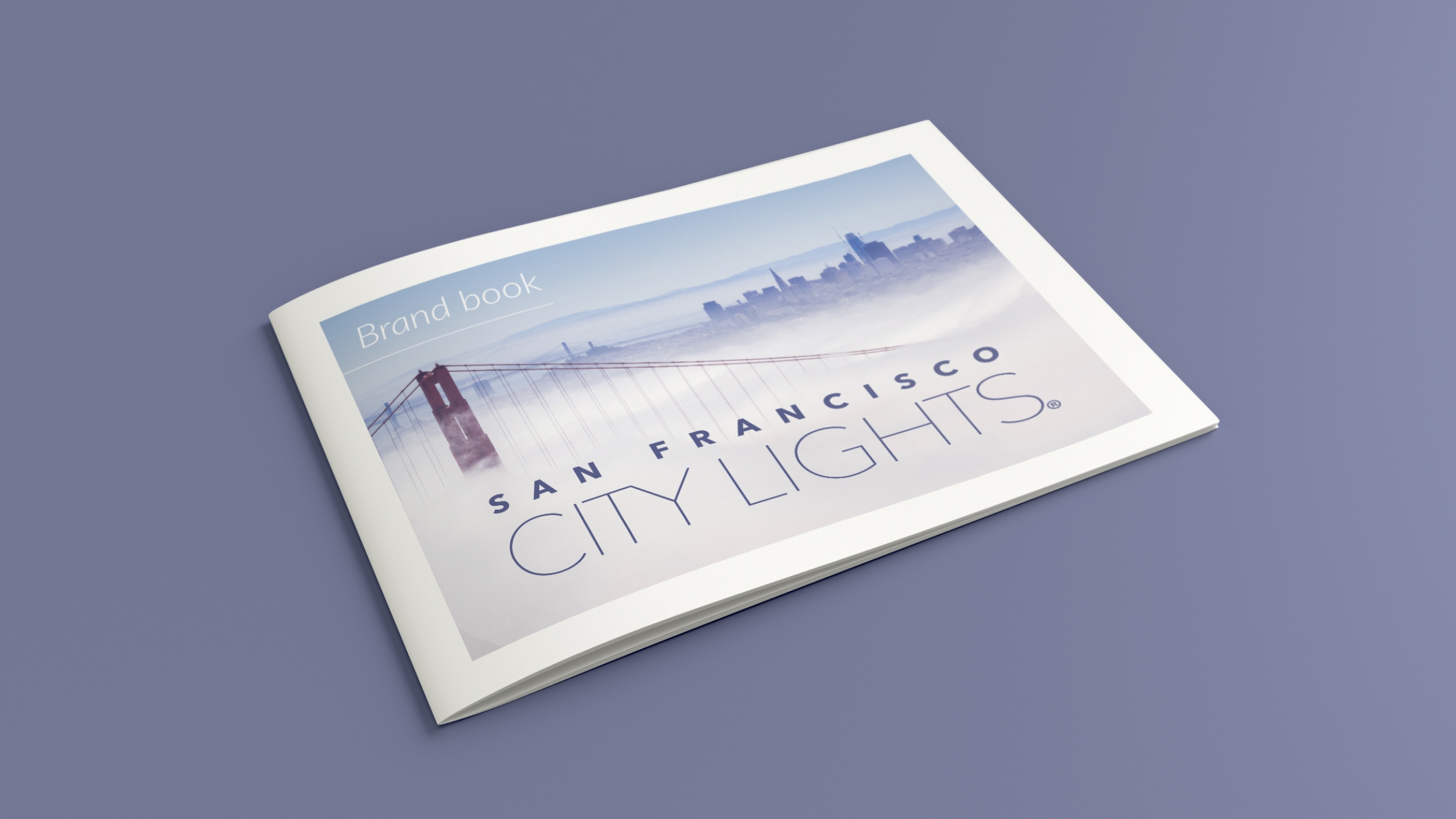
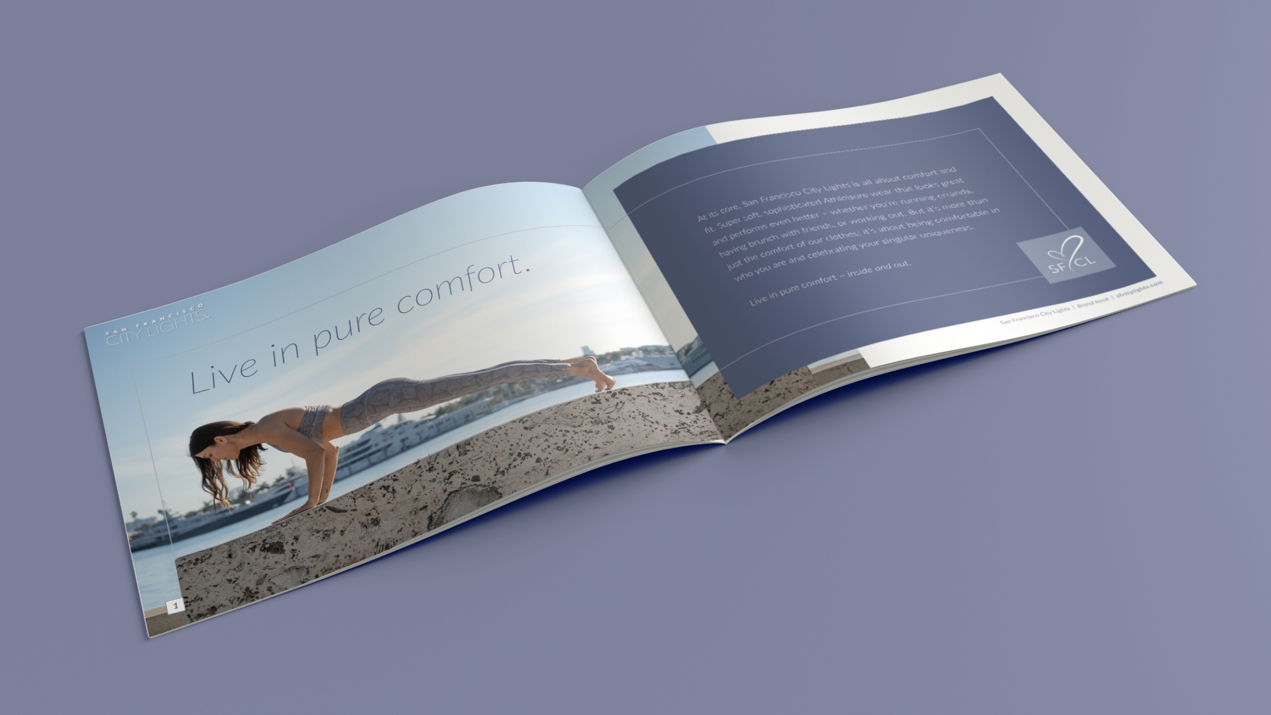
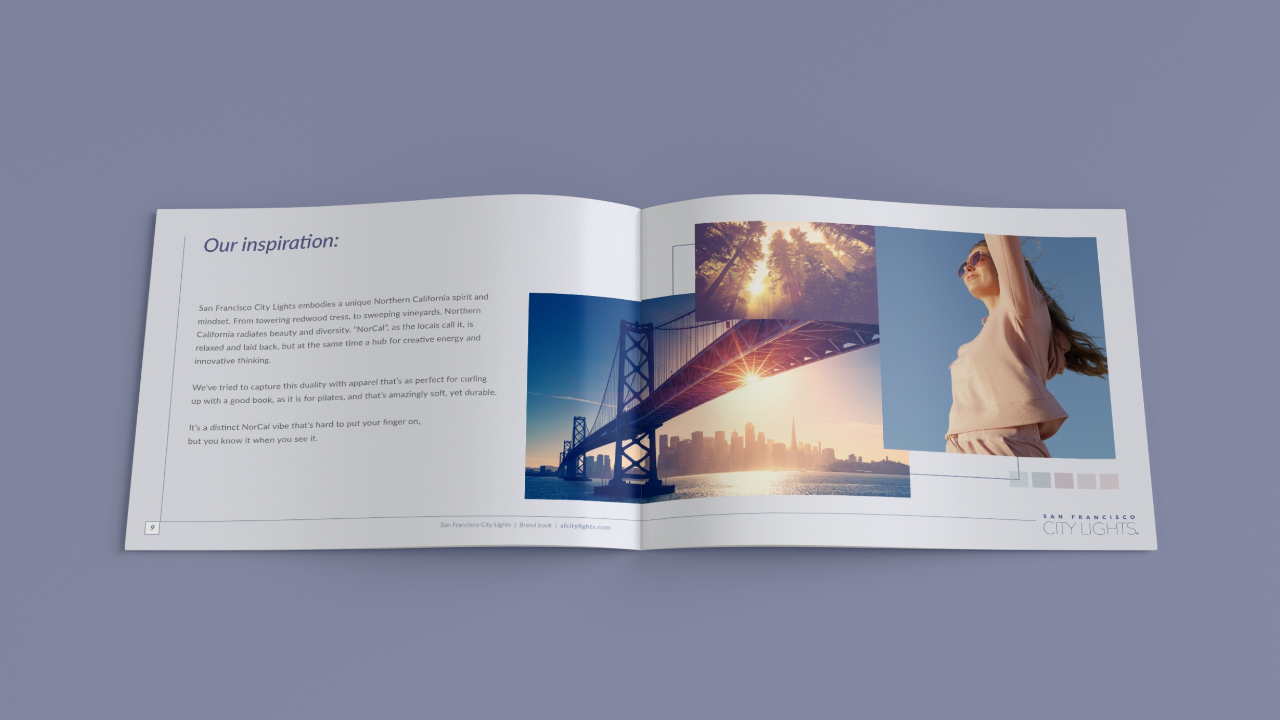
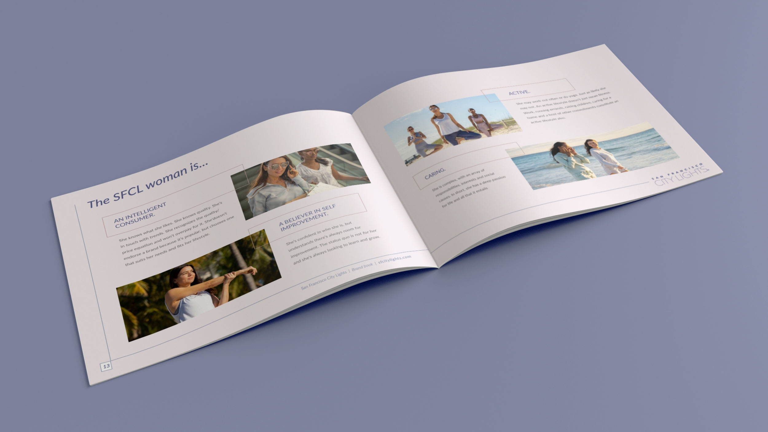
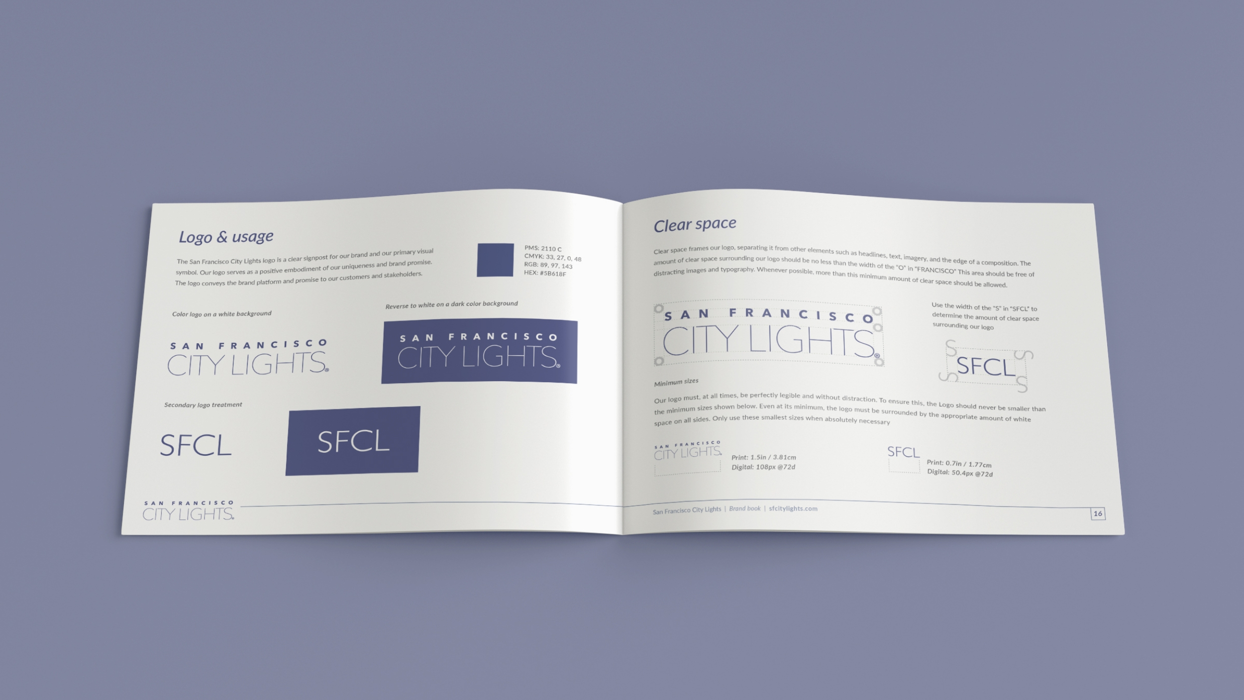
San Francisco City Lights was an opportunity to create something more refined and lifestyle-focused within the broader portfolio. I developed the brand guidelines and digital experience around a clean Northern California aesthetic, defining the visual language, typography, color palette, photography direction, and tone of voice. The e-commerce experience extended that identity into a simple, editorial shopping platform built for clarity, storytelling, and ease of use.
Explore full content here →Brand and Digital Experience
Have a project in mind?
Whether it is a brand refresh, campaign, website, or something still taking shape, I would love to hear what you are working on.
Let’s Talk!